

Now, More companies are entering the data science fields. Data visualization is the only way to understand the data easily. There is some major data visualization are line plotting, Bar plotting, Histogram plotting, Scatter plotting.
Data Visualization
Data visualization is the representation of data through the use of graphics, such as charts, plots, infographics, and even animations.
Import Matplotlib
Matplotlib is a comprehensive library for creating static, animated, and interactive visualizations in Python. For more information visit: https://pypi.org/project/matlablib/

Line Plotting
To draw a line in matplotlib, use the plt.plot() function and pass it a list of numbers used as the y-axis values.
from matplotlib import pyplot as plt

#x-axis values
x = [1, 2, 3, 4, 5]
# Y-axis values
y = [1, 2, 3, 4, 5]

# Function to plot
plt.plot(x,y)

#Title
plt.title('Line Plot')

#Give name for x,y axis
plt.ylabel('Y axis')
plt.xlabel('X axis')

# function to show the plot
plt.show()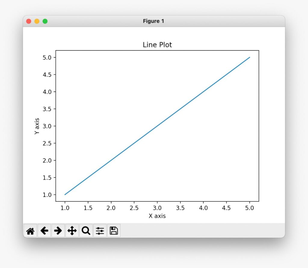
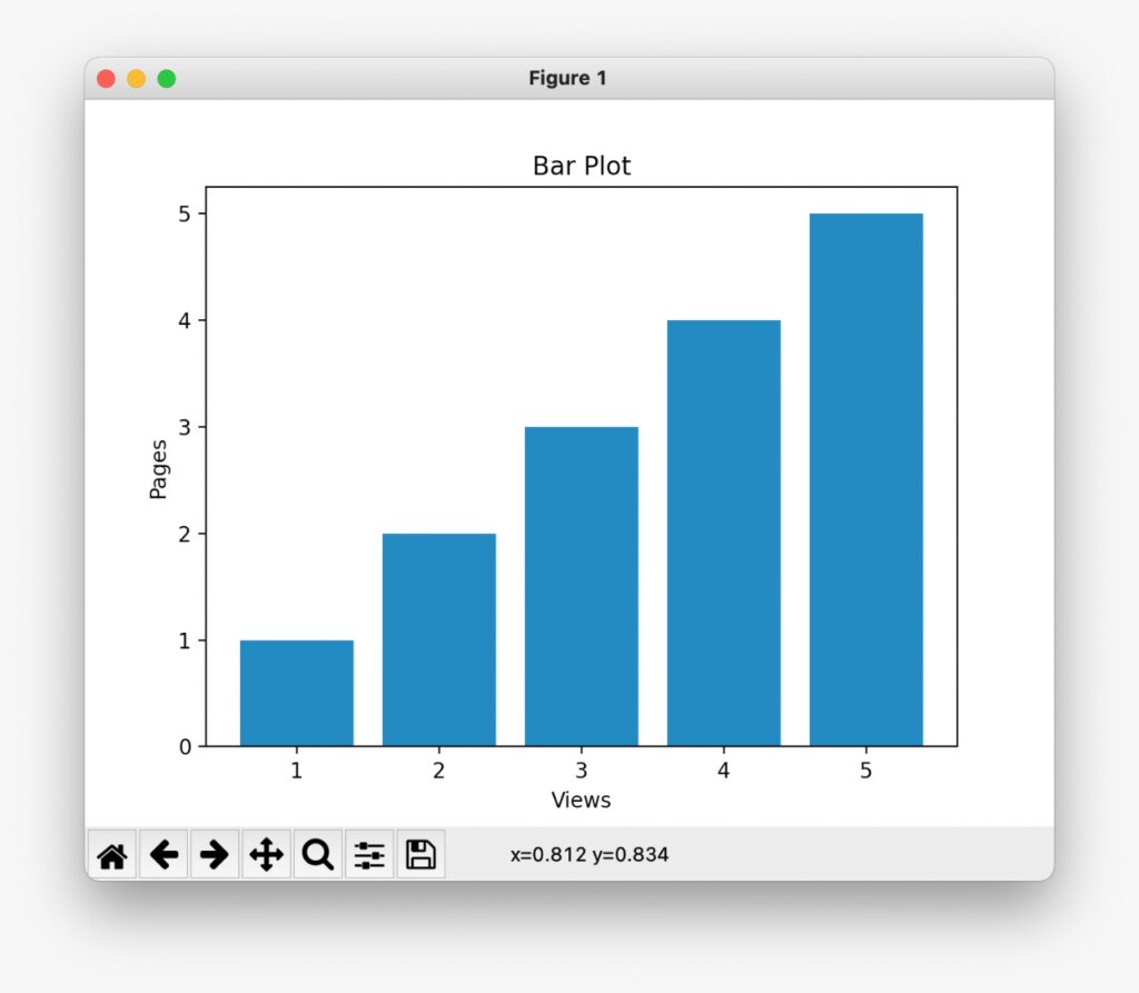
Bar Plotting
To draw a bar in matplotlib, use the plt.bar() function.
from matplotlib import pyplot as plt

#x-axis values
x = [1, 2, 3, 4, 5]
# Y-axis values
y = [1, 2, 3, 4, 5]

# Function to plot
plt.bar(x,y)

#Title
plt.title('Bar Plot')

#Give name for x,y axis
plt.ylabel('Pages')
plt.xlabel('Views')

# function to show the plot
plt.show()
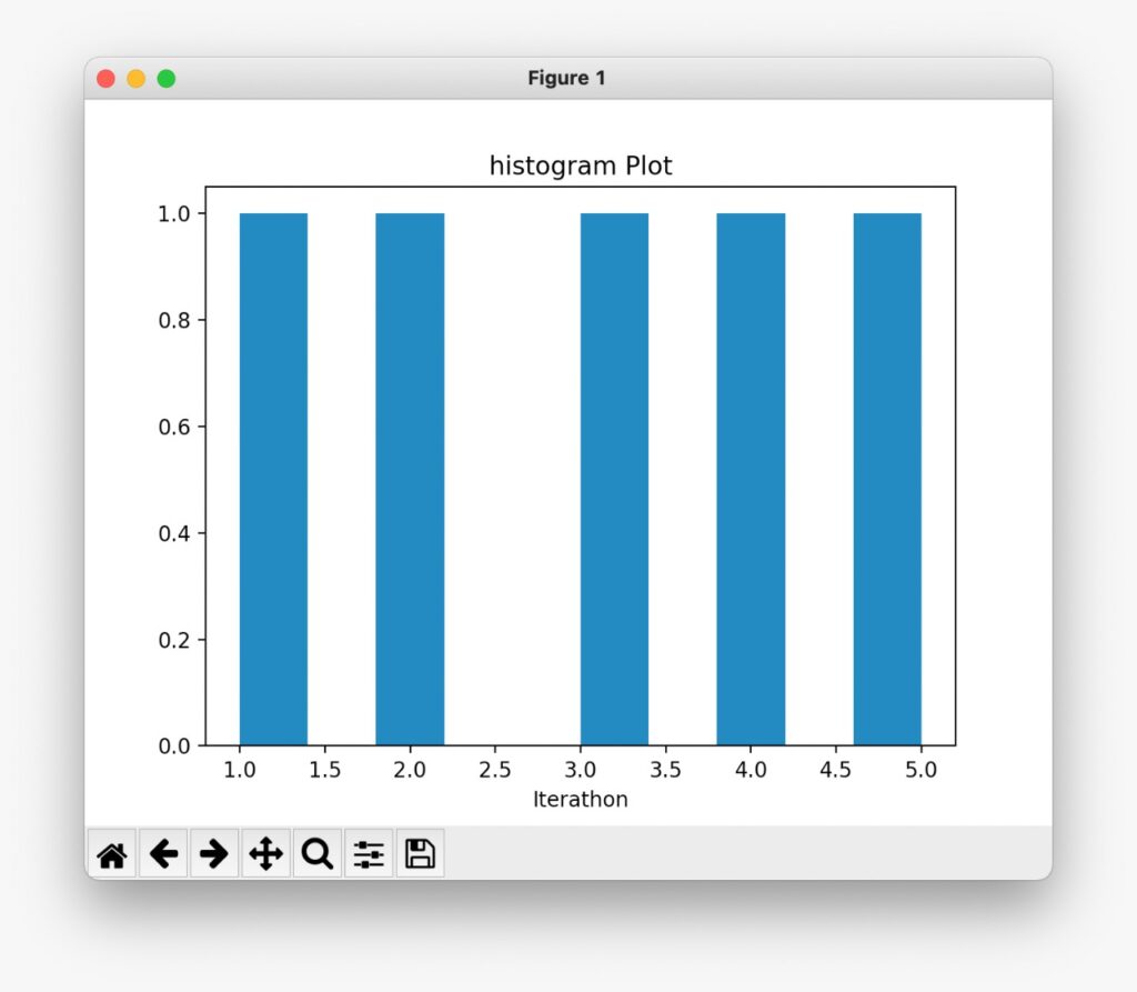
Histogram Plotting
The frequency distribution histogram is plotted vertically as a chart with bars that represent numbers of observations within certain ranges (bins) of values. To draw a bar in matplotlib, use the plt.hist() function.
from matplotlib import pyplot as plt

# Y-axis values
y = [1, 2, 3, 4, 5]

# Function to plot
plt.hist(y)

#Title
plt.title('Histogram Plot')

#Give name for x,y axis
plt.xlabel('Iterathon')

# function to show the plot
plt.show()
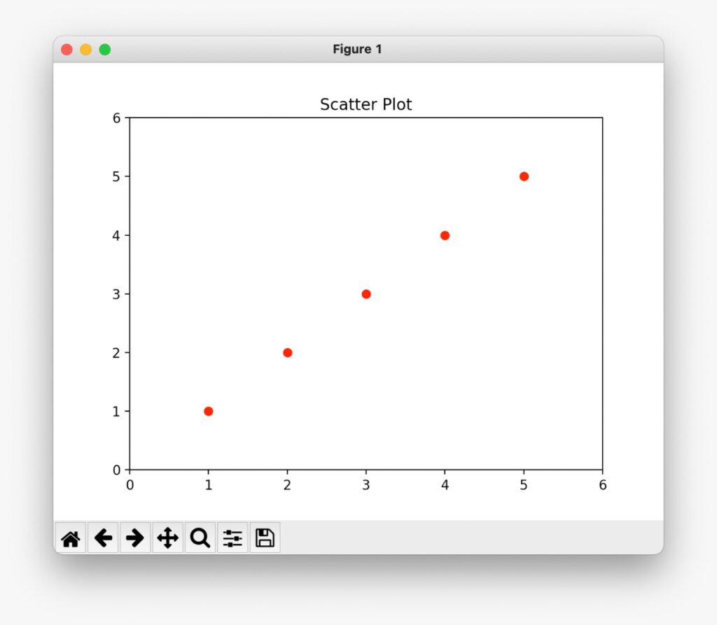
Scatter Plotting
A scatter plot uses dots to represent values for two different numeric variables. Scatter plots are used to observe relationships between variables.
from matplotlib import pyplot as plt

# Function to plot and values
plt.plot([1,2,3,4,5],[1,2,3,4,5],'ro')

#Title
plt.title('Scatter Plot')

#make red circles
plt.axis([0,6,0,6])

# function to show the plot
plt.show()
Related Post
How to Impress a girl’s heart using python heart: https://iterathon.tech//how-to-impress-a-girlfriend-heart-using-python/
Random Password Generator in Python: https://iterathon.tech//random-password-generator-in-python/
Difference between Data Science Vs Machine learning? : https://cybrblog.tech/difference-between-data-science-vs-machine-learning/
Learn Something New ❣